
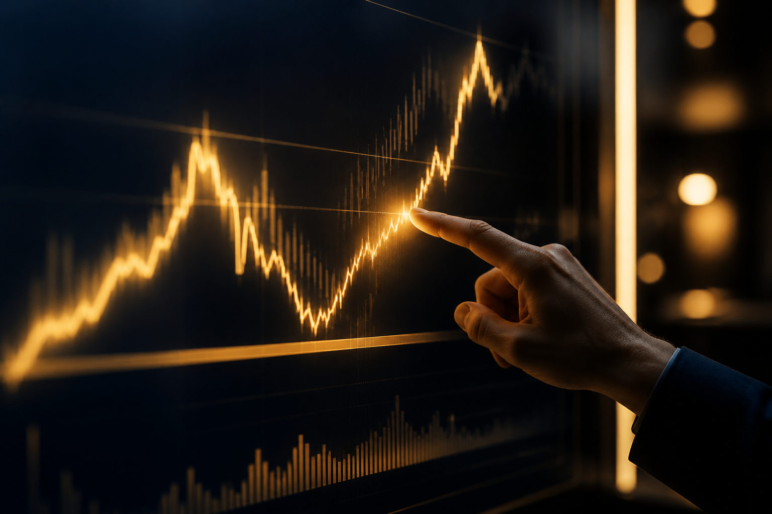
A graph of bitcoin prices is most useful when it helps you read trend, market participation, and key areas on the chart instead of reacting to every move. The goal is not to guess each swing, but to understand what the chart is actually showing.
What a graph of bitcoin prices is really showing
Many readers open a graph of bitcoin prices and focus only on whether the line is rising or falling. That is the surface level. The bigger value is that the chart records where buyers and sellers were willing to trade over time, which lets you see where momentum built, where it faded, and where the market paused.
The most common chart types are line charts and candlestick charts. A line chart is easier for a quick read because it strips the move down to a simple path. A candlestick chart carries more detail within each period, showing the open, close, high, and low, which makes it better for reading shorter-term behavior.
| Chart type | Best for | What it helps you see | Main limitation |
|---|---|---|---|
| Line chart | Beginners and big-picture readers | General direction, major turns, broad trend | Less detail inside each time period |
| Candlestick chart | Readers who want more structure | Short-term strength, rejection, volatility inside a period | More information to process |
The same graph can look calm or chaotic depending on the time frame. Very short periods often contain a lot of noise, while daily or weekly views tend to show structure more clearly. Before reading any chart, decide what question you want answered: are you checking a short-term move, or trying to understand a wider trend?
The first elements to read before adding anything else
You do not need to start with complex indicators. A cleaner process is to read the time frame first, then price structure, then trading activity, and only after that mark key support and resistance areas. That order keeps your attention on the chart itself.
Time frame changes the meaning of each move. A sharp swing on a very short chart may look dramatic, yet the same move can appear minor on a broader view. People often misread a brief bounce as a major turn because they are watching a chart that is too small for their purpose.
Price structure is the clearest starting point. On a graph of bitcoin prices, a series of higher highs and higher lows usually points to an uptrend, while lower highs and lower lows suggest that sellers still have control. This basic read is more useful than staring at one candle in isolation.
Trading activity adds context. If price advances and participation expands with it, the move often has better follow-through. If price jumps around but activity does not support the move, the chart may be showing a weaker push that deserves caution.
| Chart element | What to check | Why it matters |
|---|---|---|
| Time frame | Short, medium, or long view | Helps separate noise from structure |
| Price structure | Whether highs and lows are rising or falling | Shows trend direction |
| Trading activity | Whether participation grows with the move | Adds conviction or doubt to price action |
| Support and resistance | Areas where price repeatedly stalls or turns | Marks likely pressure or demand zones |
How to read trend, pullbacks, and range behavior
A common mistake is to treat every rise as a fresh breakout and every drop as the end of a trend. A better read starts with the sequence of highs and lows. When the chart keeps building upward from one swing to the next, the market is often still in a constructive phase. When rallies fail and lows keep slipping, the pressure is usually still downward.
Pullbacks do not automatically mean reversal. In a rising market, temporary retreats are normal because traders take profit, new buyers wait for better entries, and the market tests whether demand still exists at lower levels. The key question is what happens after the pullback: does price hold an important area and recover, or does it lose structure and fail to regain strength?
Ranges deserve more respect than they usually get. A graph of bitcoin prices often spends long stretches moving sideways inside a zone where neither side has firm control. That can feel unproductive, but range conditions are often where the next larger move is prepared. For chart readers, the task is to define the boundaries and watch whether price is accepted outside them or pushed back inside.
One simple framework helps keep decisions clear: identify direction first, then location, then timing. If direction is unclear, timing signals become less reliable. If location is poor, even a correct directional idea can lead to weak trade quality.
Frequent reading mistakes and better habits
The first mistake is using only the piece of the chart that supports an existing opinion. Someone sees a short burst higher and assumes the market has changed, while the broader structure may still be flat or weak. Switching between a wider chart and a shorter one reduces that bias.
The second mistake is relying on one signal as if it can replace chart reading. Indicators can help, but they work best after you already understand the shape of the market. If trend, range, and key levels are unclear, a single indicator reading will not solve the problem.
The third mistake is treating a graph of bitcoin prices like a machine that produces certainty. Charts improve the quality of a decision, but they do not remove uncertainty. Good reading is less about finding perfect calls and more about seeing what conditions would support one view over another.
| Common mistake | Why it causes trouble | Better habit |
|---|---|---|
| Watching only very short charts | Noise can look like a major move | Start with a broader chart, then zoom in |
| Depending on one indicator | Price structure gets ignored | Read trend and zones before adding tools |
| Reacting to the latest candle | Emotion takes over interpretation | Wait for structure to develop |
| Expecting certainty from the chart | Risk is handled poorly | Use charts as probability tools |
FAQ
Should beginners use a line chart or a candlestick chart first?
A line chart is often the easier place to start because it makes the overall move easier to see. Once you can identify trend and range behavior, candlesticks become much more useful.
Why does a graph of bitcoin prices look different across platforms?
Platforms may use different data sources, default settings, and time zones. Before comparing charts, check that you are looking at the same trading pair and the same time frame.
Which time frame is best for reading bitcoin price charts?
There is no single best setting for everyone. Daily and weekly charts are usually better for market structure, while shorter charts help with timing and fine detail.
Does a sudden jump or drop mean the trend has changed?
Not by itself. A sharp move matters more when the next swings confirm it by holding a new area or by breaking an important zone with follow-through.
Where can I check live bitcoin price charts?
Use a major market data service or a large exchange chart with clear time-frame controls and visible trading activity. A clean interface and consistent updates matter more than flashy extras.
If you want a practical routine, keep one main time frame for your regular read, use a wider chart to confirm the bigger picture, and then use a shorter chart only to refine details. That approach makes a graph of bitcoin prices far easier to interpret without getting lost in noise.