
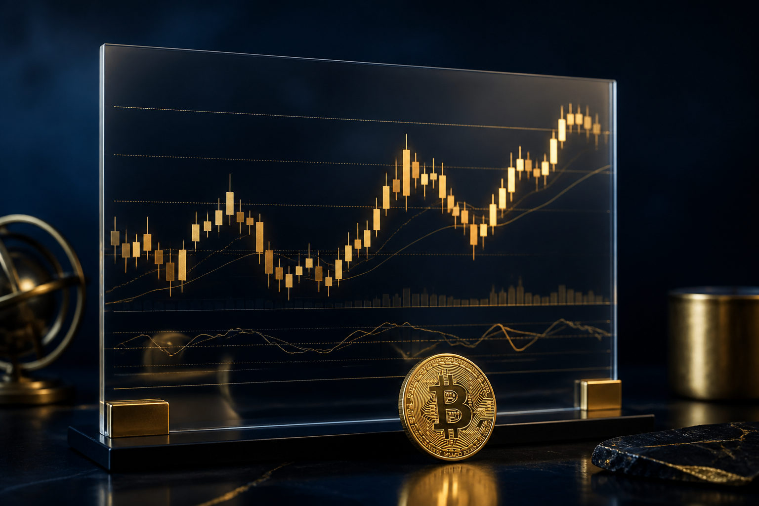
How to read bitcoin price charts starts with three things: where price is, what the candlesticks are showing, and whether the broader move is rising, falling, or stuck in a range. As of August 2, 2026, Bitcoin is trading at $62500.
Start with the live chart data before reading the candles
Before looking for patterns, read the basic numbers around the chart. According to CoinGecko and alternative.me data, they give context for whether you are looking at a routine move or a market that is already under emotional pressure.
| Metric | Value |
|---|---|
| Price | $62500 |
| 24-hour change | -0.68% |
| Market cap | about $1.25 trillion |
| Fear & Greed Index | 27 (Fear) |
| Data time | August 2, 2026 |
If you are learning how to read bitcoin price charts, do not begin by drawing lines everywhere. That day, Bitcoin is at $62500, the 24-hour move is -0.68%, and the Fear & Greed Index is 27. That combination tells you the chart is sitting in a cautious mood, not in a carefree one.
This first step matters because many beginners zoom in on one candle and ignore the market setting around it. When that happens, a normal bounce can look like a reversal, and a routine pullback can look more dramatic than it really is.
What a candlestick is actually telling you
A candlestick is a compact record of price action over a chosen period. It does not just show that price moved. It shows where the push started, how far it stretched, and where the market settled when that period ended.
There are three practical parts to read. First, look at the body, which usually shows how direct the move was during that period. Second, look at the upper and lower wicks, which show rejection or failed extension away from the close. Third, and this is the part that people miss, look at where the candle appears in the chart structure.
The same candle can mean different things in different places. A candle with a long lower wick after a decline may show buying interest at lower levels. That same shape after a sharp rise may only show volatility inside an up move. The candle itself is not the full message; the location gives it meaning.
Another common mistake is treating one candle as a full answer. Charts work more like a sentence than a single word. You need to see what the next candles do with that signal. Do they confirm it, weaken it, or ignore it completely?
Trend matters more than memorizing chart names
If your goal is to understand how to read bitcoin price charts, trend reading will help more than memorizing every classic setup. Most chart patterns only make sense after you decide whether price is continuing, losing momentum, or changing direction.
A useful way to begin is to ask three questions. Are highs getting pushed higher or failing earlier? Are pullbacks holding above prior areas, or breaking under them? When price drops, does it recover quickly, or does selling keep control for longer?
In an uptrend, the market often forms higher highs and higher lows. In a downtrend, rebounds tend to struggle under previous peaks, and lower lows remain part of the structure. In a range, price keeps moving but does not establish a clear directional sequence, which is why sideways periods confuse so many newer traders.
Bitcoin price charts can move quickly, so a chart can look dramatic in a short window while still being ordinary in a wider one. That is why zooming out helps. The job is not to predict the next candle with certainty. The job is to identify which side is controlling the structure.
How support, resistance, and sentiment fit together
Support and resistance are better treated as zones, not exact lines. Support is an area where buyers are more willing to respond. Resistance is an area where sellers are more likely to appear. The chart becomes useful when you watch how price behaves near those zones.
If price approaches support and candles begin to recover from intraperiod weakness, that can show buying interest. If price reaches resistance and repeatedly fails to hold higher ground, that may show overhead selling pressure. On bitcoin price charts, the reaction near an area often matters more than the label attached to it.
The Fear & Greed Index is 27 that day, which is in Fear. That does not mean price must keep falling, and it does not guarantee that every rebound will fail. What it does provide is emotional context. In a fearful market, breaks of support may trigger stronger reactions, while rebounds can face hesitation more quickly.
So sentiment should support your chart reading, not replace it. Candles show behavior. Sentiment helps explain the environment in which that behavior is happening.
Common mistakes when reading BTC charts
The first mistake is reading every large candle as a major signal. Bitcoin is volatile by nature, so a sharp move on its own is not enough. What matters is whether the market follows through.
The second mistake is staying too zoomed in. A move that looks huge in a short window may be minor inside a broader structure. Reading charts without checking the larger frame often leads to overreaction.
The third mistake is ignoring the numbers around the chart. That day, the 24-hour change is -0.68% and the Fear & Greed Index is 27. If the market tone is already cautious, a weak bounce should not be read the same way as a bounce in a more confident environment.
The fourth mistake is expecting charts to provide certainty. They do not. A chart helps organize probability and structure. It does not remove uncertainty from the market.
FAQ
What should beginners look at first on a Bitcoin candlestick chart?
Start with the candle body, then the wicks, then the candle’s location in the larger structure. Location is the part that gives the candle its actual meaning.
Is it better to read short-term or long-term BTC charts first?
Start with the larger structure, then move down to the shorter view. The wider chart helps with direction, while the shorter one helps with pace and reaction.
How should I use the Fear and Greed Index with a price chart?
Use it as context rather than a signal by itself. With the index at 27 that day, the market mood is cautious, so support breaks and weak rebounds deserve closer attention.
Can I understand Bitcoin charts just by learning candle patterns?
Not very well. A pattern without trend and location can be misleading, because the same shape may carry a different message in another part of the chart.
What is the most practical order for reading a BTC chart?
Check price, the 24-hour change, market cap, and sentiment first. After that, read the candle sequence and then watch how price reacts near support and resistance zones.
If you want a simple routine, use the same order each time: read the key data, inspect candle position, then study reactions near important areas. That habit will make bitcoin price charts much easier to understand without guessing from one candle alone.
Disclaimer: This article is for informational and educational purposes only and is not investment, financial, or legal advice. Crypto assets are highly volatile and you could lose your entire investment. Do your own research and decide carefully.